Please wait, amazing things are loading

Met zn allen

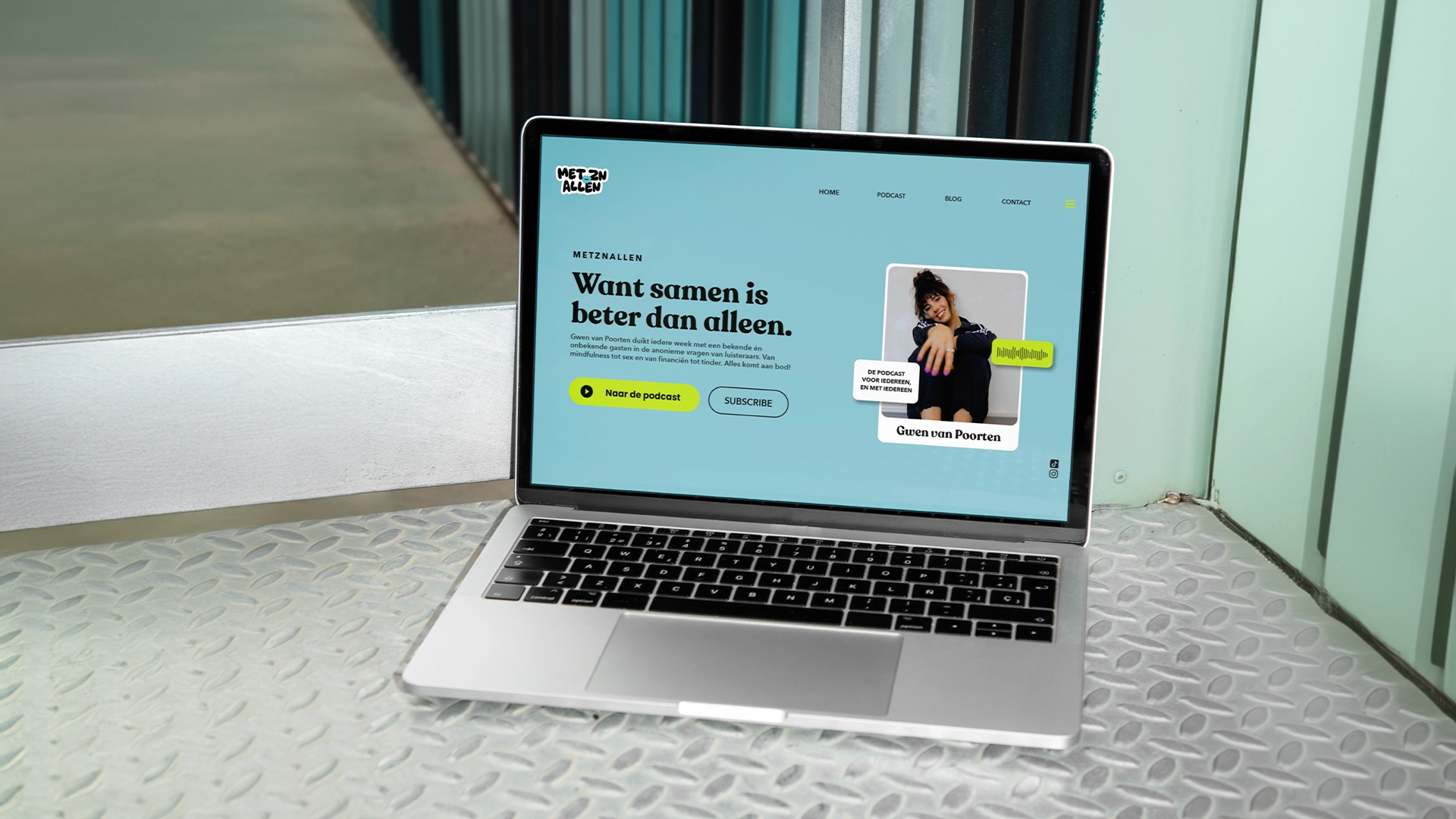
Metznallen is a podcast and self-development platform created by Gwen van Poorten. Initially focused on answering listeners questions by discussing them with a podcast guest, it has now evolved into a broader platform dedicated to making self-development accessible and easy for everyone.


Client: Gwen van Poorten
Agency: Que Pasa Graphics
Strategy: Paul Tholen
Design: Yasmine Bouma
ART-DIRECTION // BRAND IDENTITY // SOCIAL MEDIA // ART-DIRECTION // BRAND IDENTITY // SOCIAL MEDIA // ART-DIRECTION // BRAND IDENTITY // SOCIAL MEDIA //

SOCIAL MEDIA // ART-DIRECTION // BRAND IDENITY // SOCIAL MEDIA // ART-DIRECTION // BRAND IDENITY // SOCIAL MEDIA // ART-DIRECTION // BRAND IDENITY //

Project

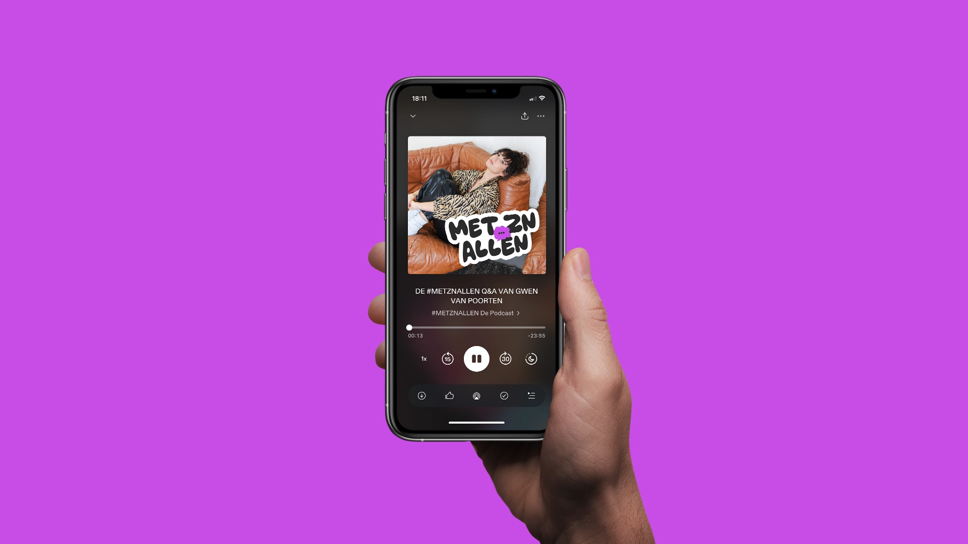
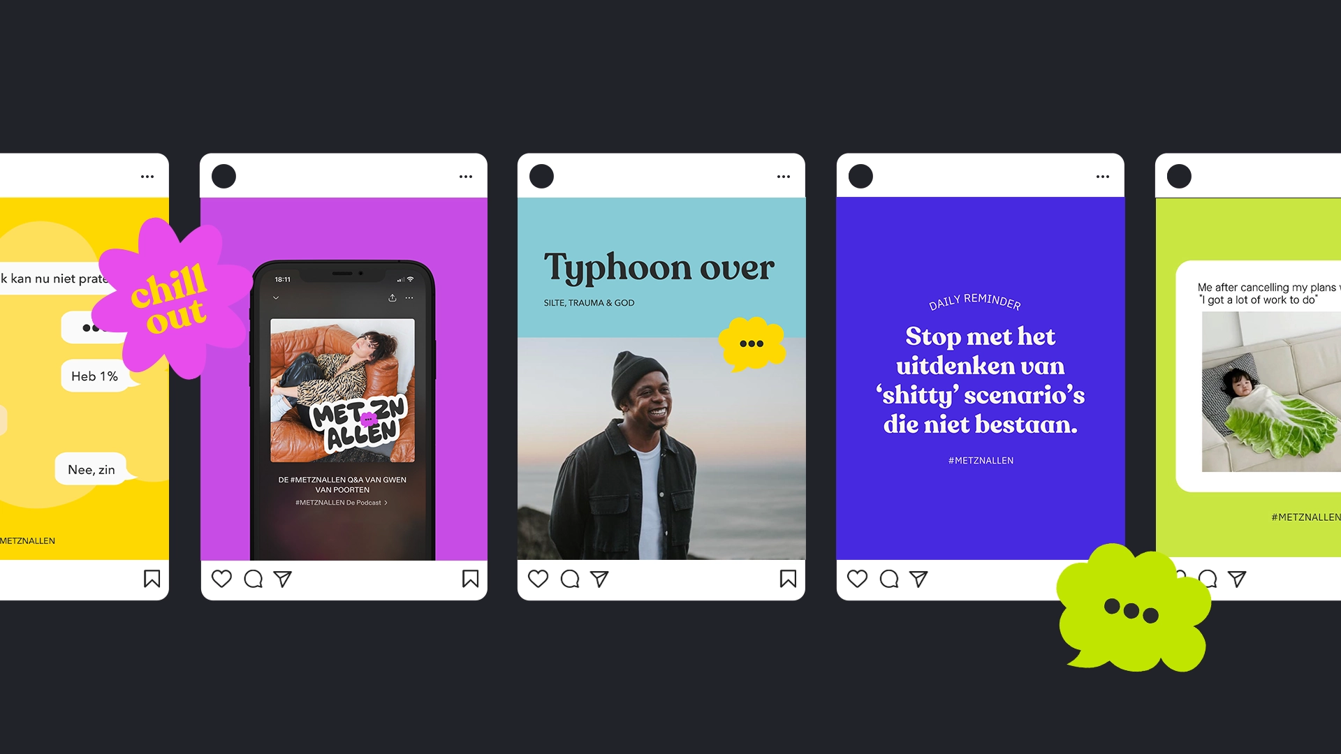
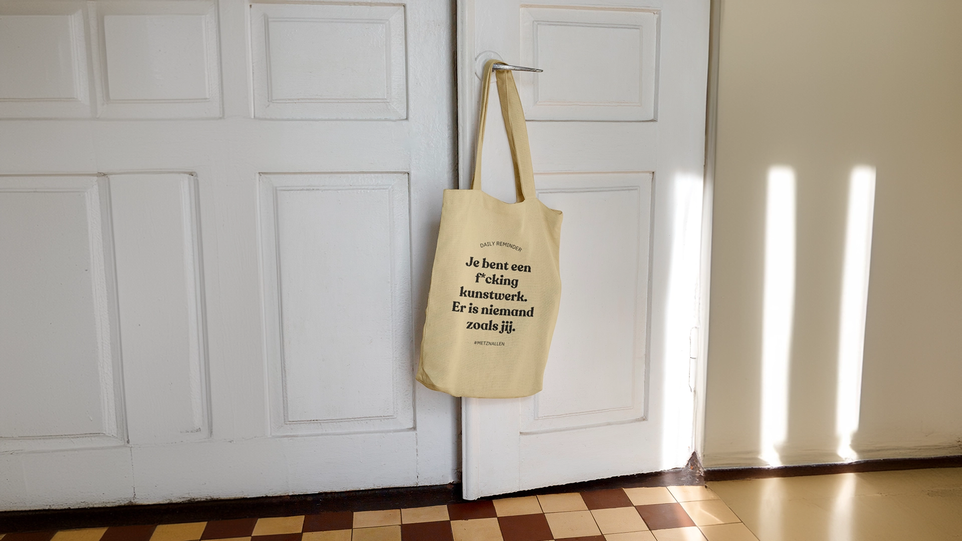
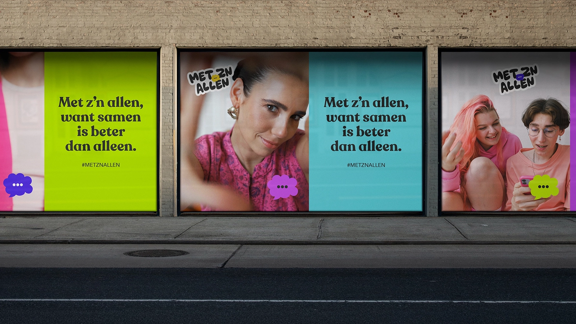
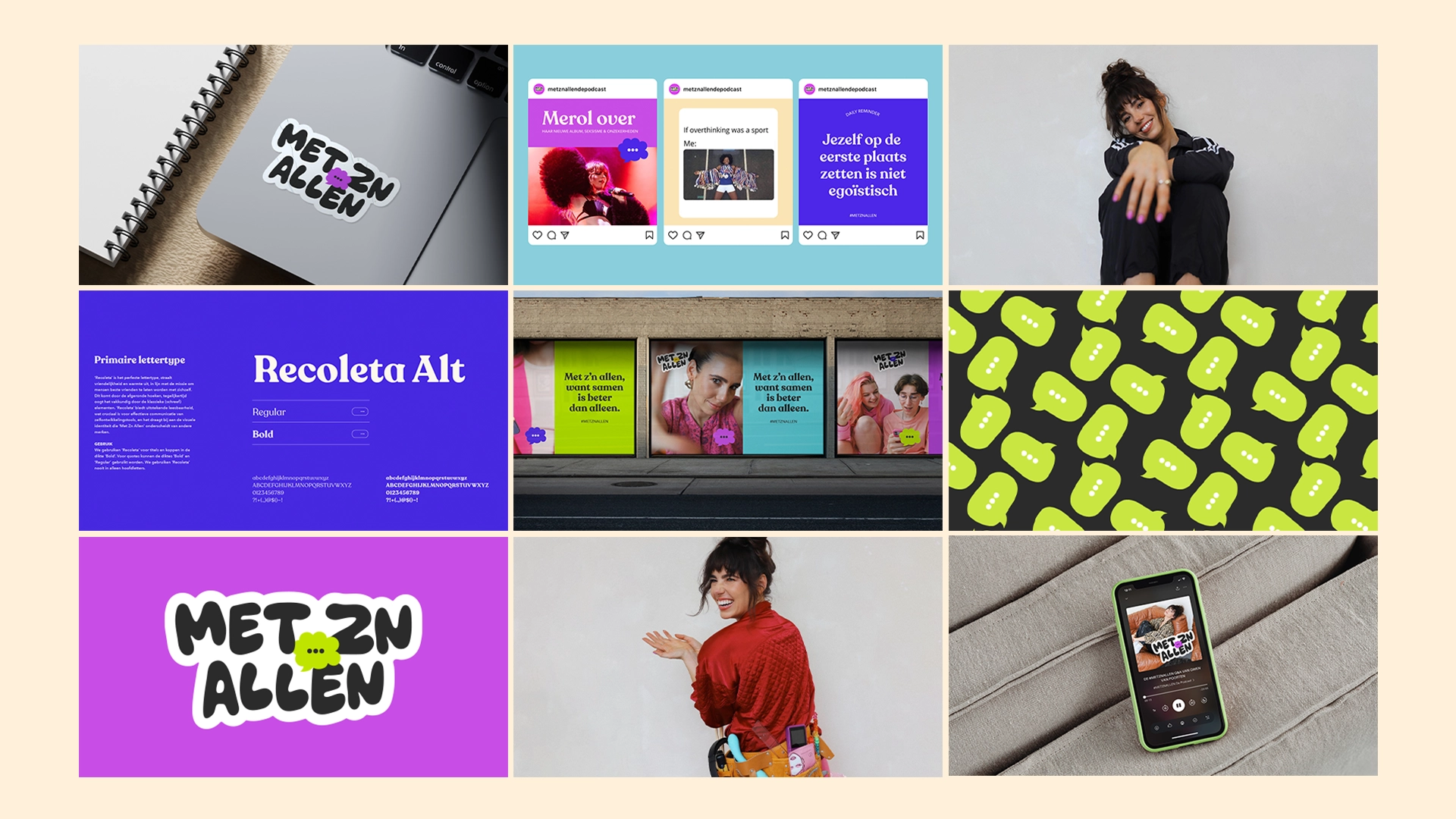
To align with its new strategy, Metznallen needed a fresh brand identity. I was in charge of the rebranding, working closely with the team to capture the brand's essence: Human, Vulnerable, Energetic, and Shiny. The vibrant color palette was carefully chosen for its psychological impact—green for growth and renewal, yellow for warmth and optimism.

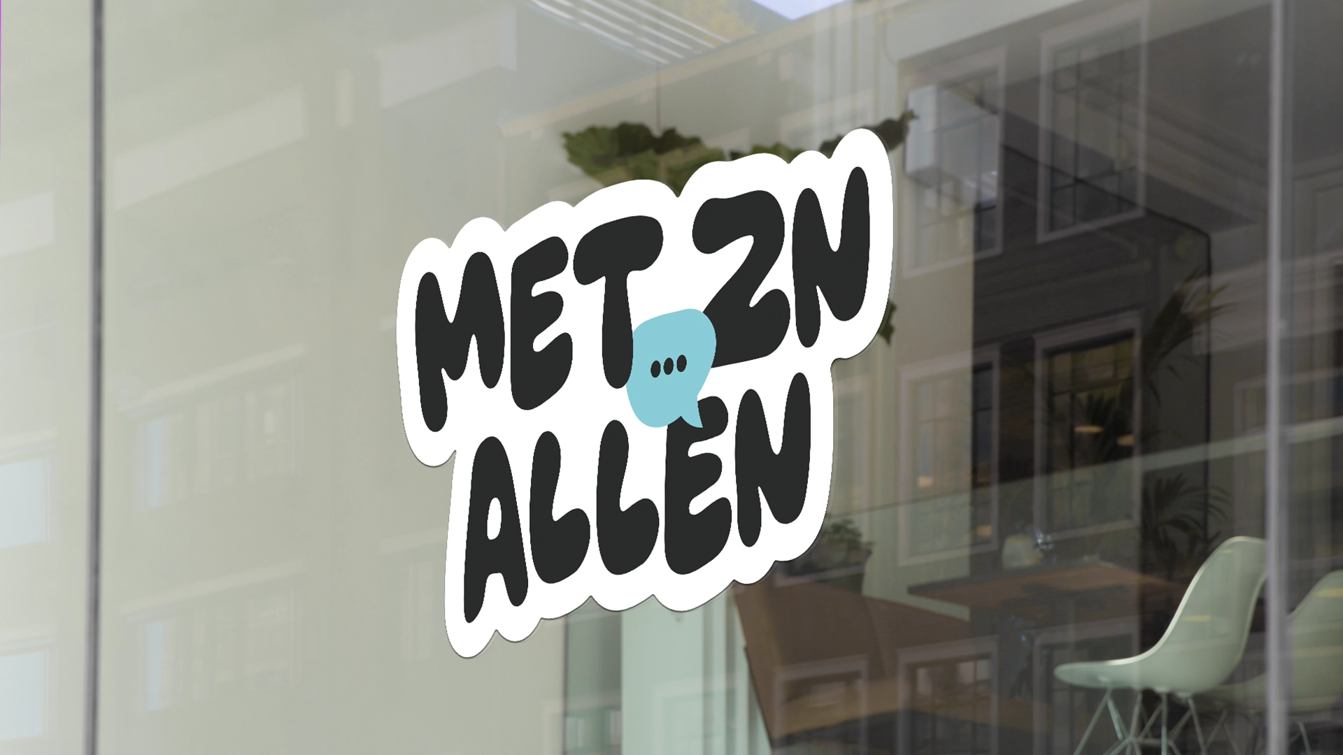
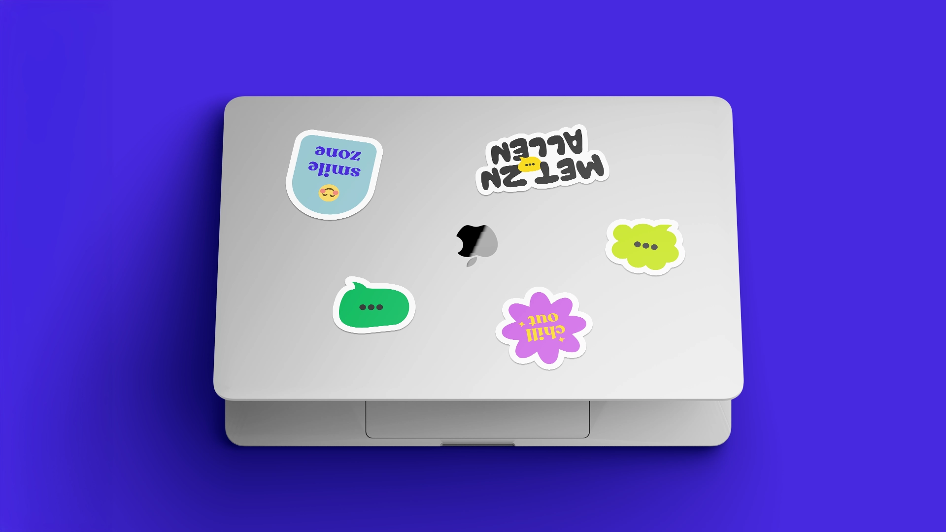
The logo features a central icon for brand recognition, with an ellipsis symbol representing an open-ended journey and moments of reflection. The rounded, organic typeface adds a human touch, fostering a sense of understanding and empathy. This design creates a strong personal connection, making the brand feel like a community.

Next Project