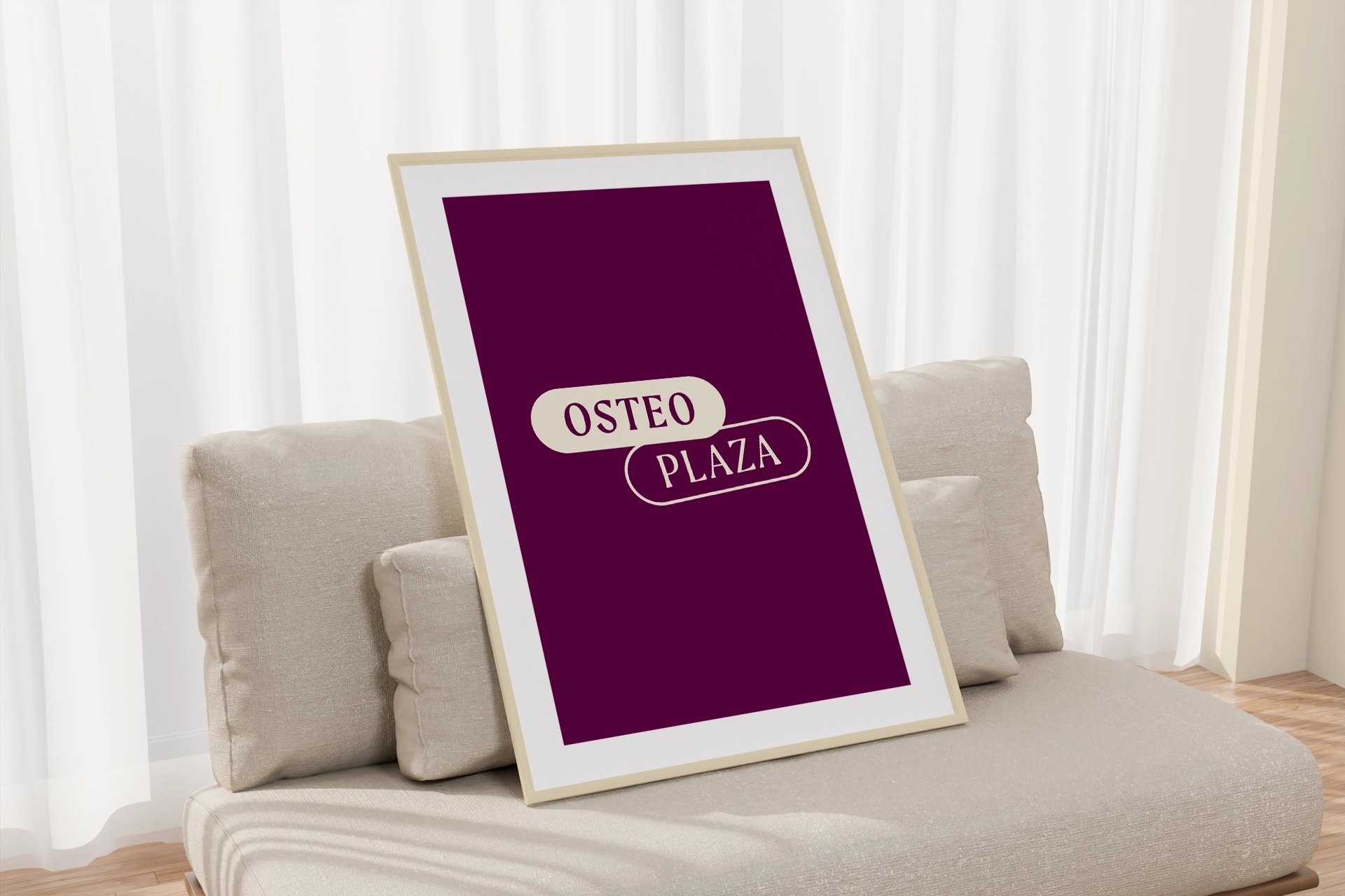
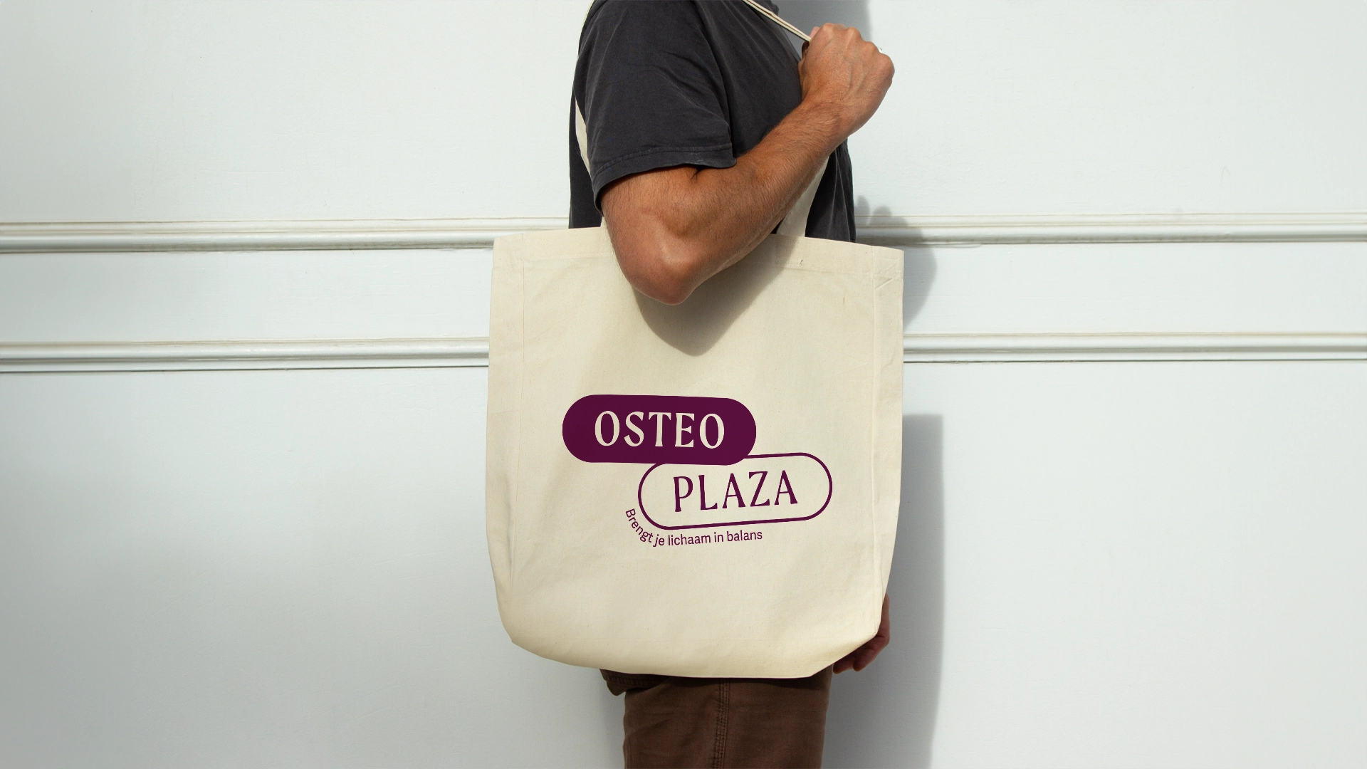
Please wait, amazing things are loading

OsteoPlaza

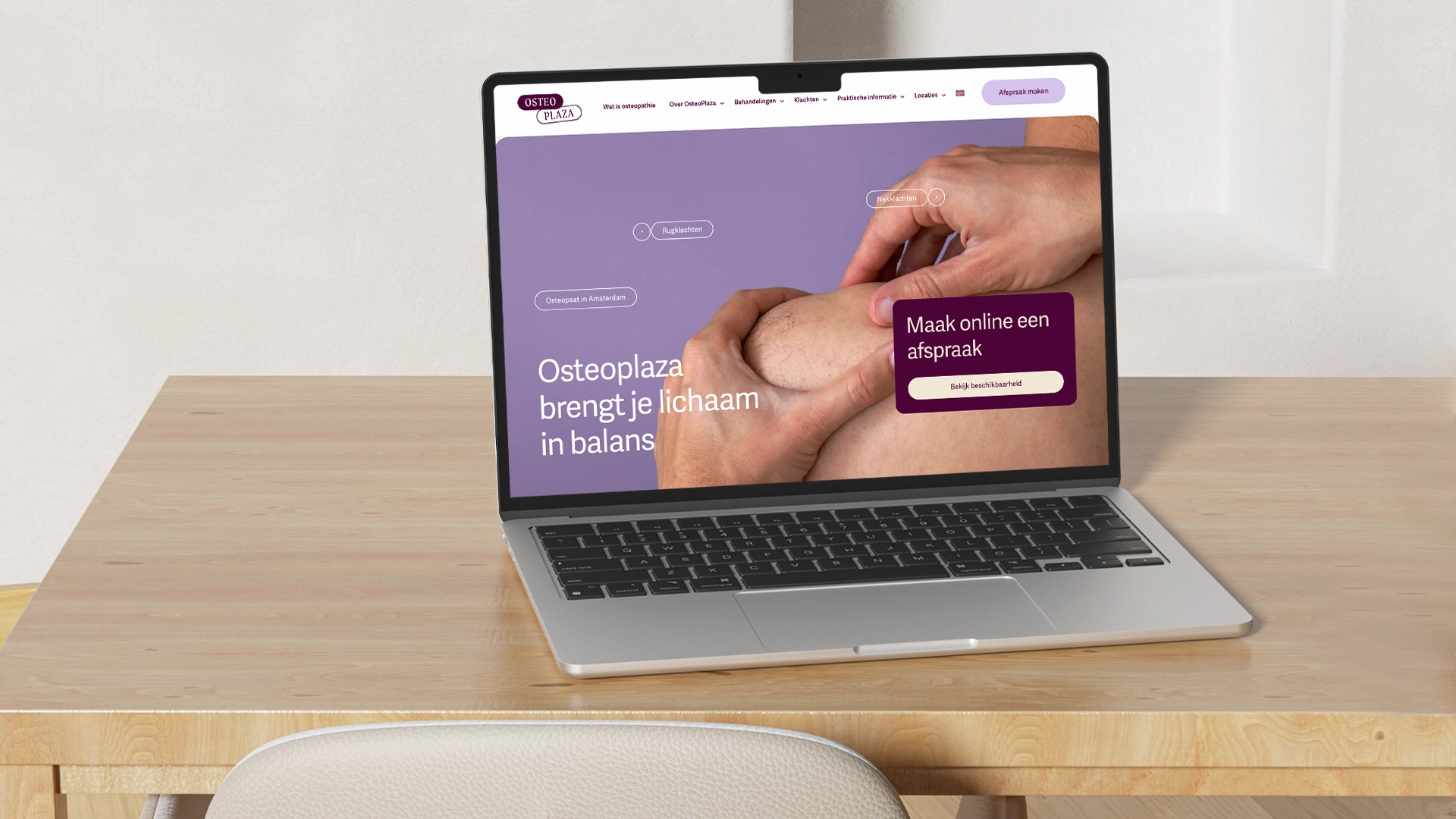
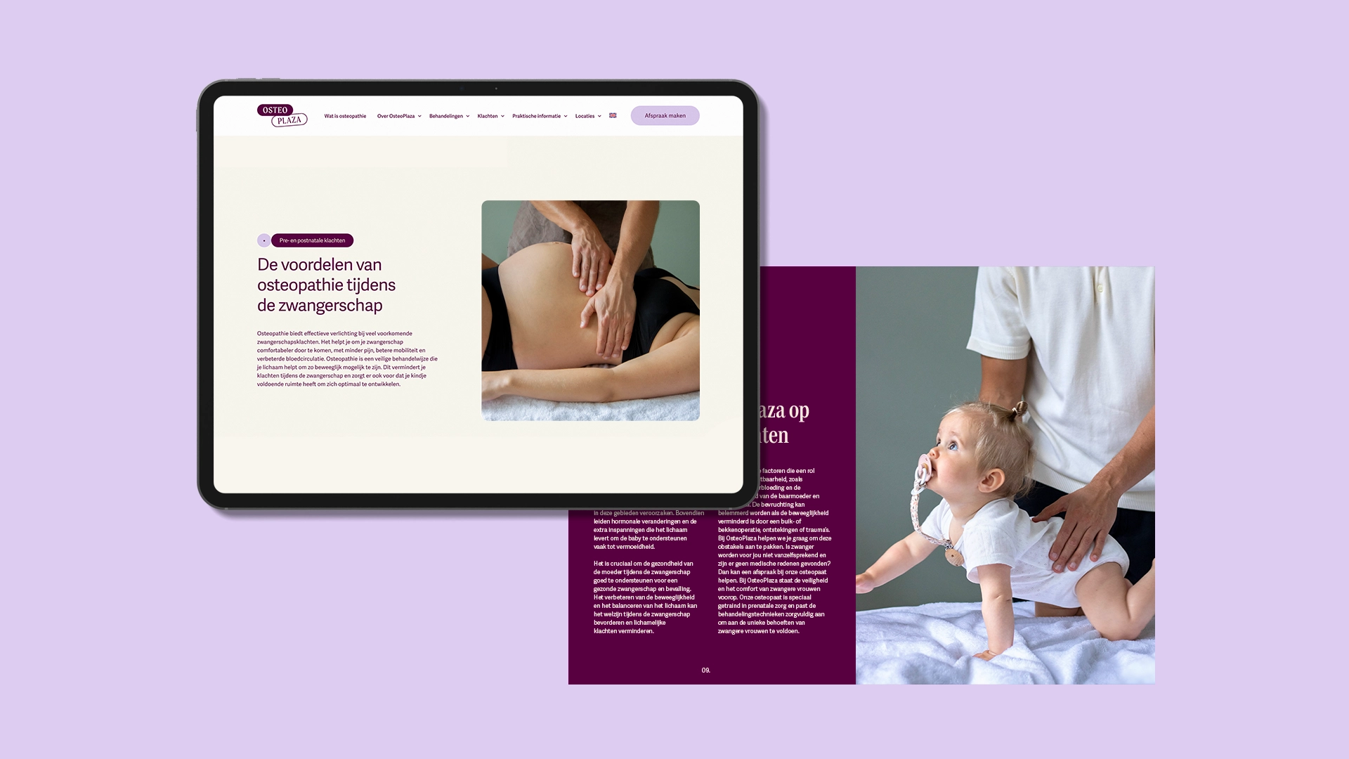
OsteoPlaza is a new osteopathy practice in Amsterdam with two locations, dedicated to restoring the balance between body and mind for optimal health and well-being. By focusing on the root cause of issues, they help people return to a life free of pain and limitations.


Client: Vincent Komen
Agency: Que Pasa Graphics
Design: Yasmine Bouma
Web design: Yasmine Bouma

// ART-DIRECTION // BRAND IDENITIY // SOCIAL MEDIA // WEB DESIGN // PHOTOGRAPHY // DTP // // ART-DIRECTION // BRAND IDENITIY // SOCIAL MEDIA // WEB DESIGN // PHOTOGRAPHY // DTP //

PHOTOGRAPHY // WEB DESIGN // ART-DIRECTION // BRAND IDENTITY // SOCIAL MEDIA // DTP // PHOTOGRAPHY // WEB DESIGN // ART-DIRECTION // BRAND IDENTITY // SOCIAL MEDIA // DTP //

Project

To stand out among other osteopaths in Amsterdam, OsteoPlaza needed a brand identity that balanced medical professionalism with warmth and humanity. The primary color, a deep purple, was chosen for its ability to convey trust, authority, and approachability—making the brand both distinctive and welcoming. In a landscape that primarily uses green and blue tones.

The logo features overlapping cilinders, symbolizing balanced movement, essential in osteopathy. The cylindrical forms within the logo resembles the vertebrae (in your spine), adding a dynamic yet grounded element that is reflected throughout the branding. With all this a unique and approachable brand identity was created, that sets OsteoPlaza apart in the Amsterdam market of osteopaths.

Next Project