Please wait, amazing things are loading

Paul Simons

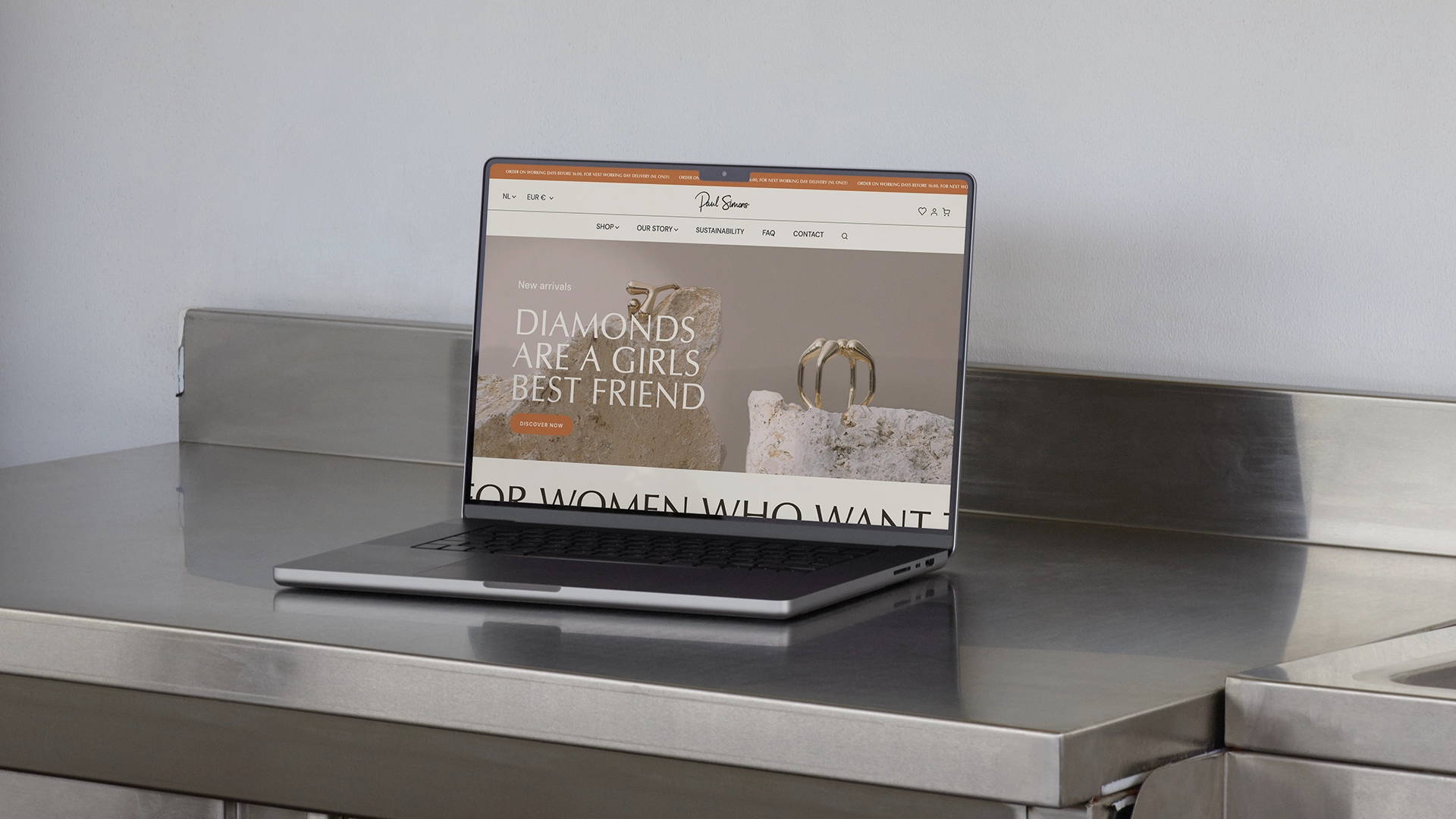
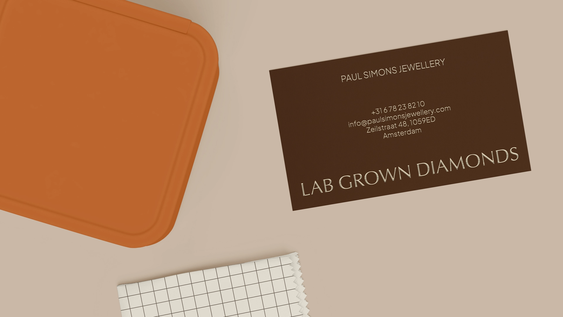
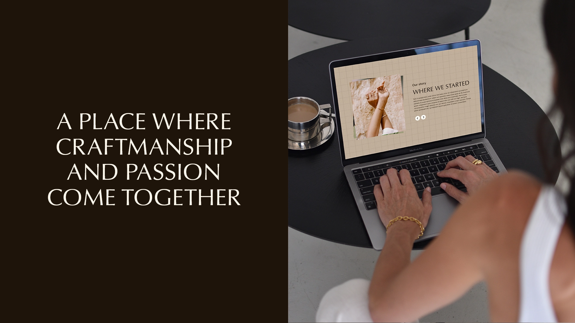
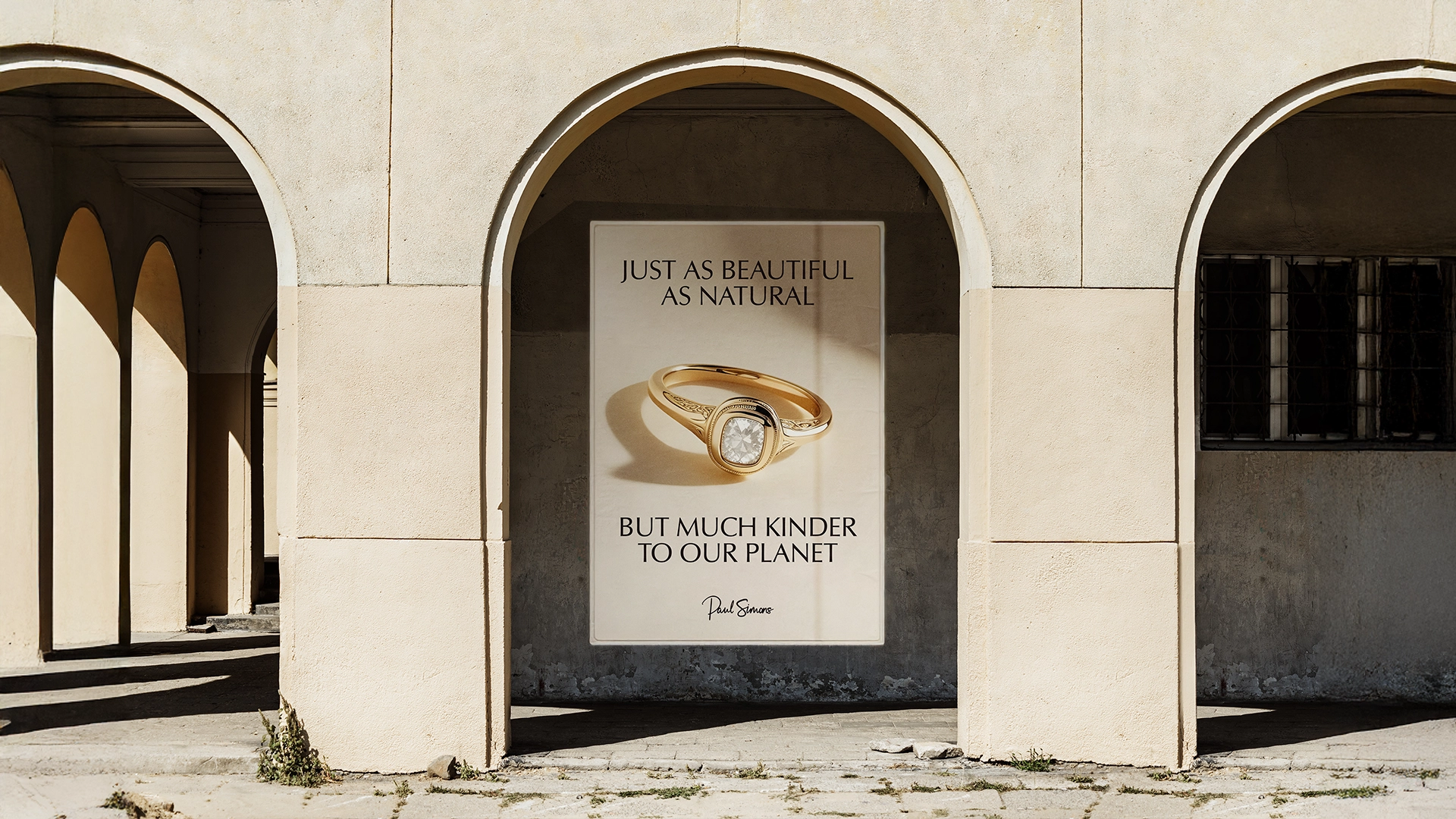
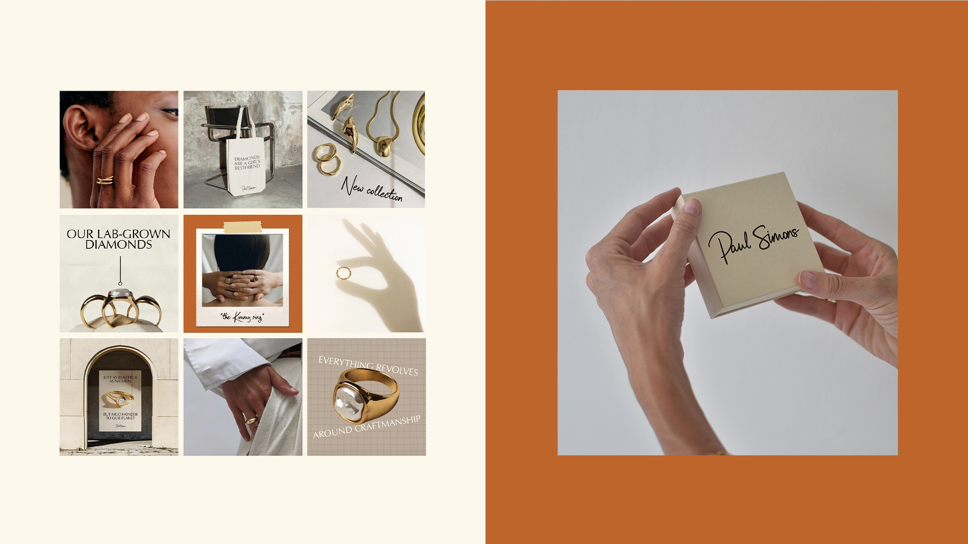
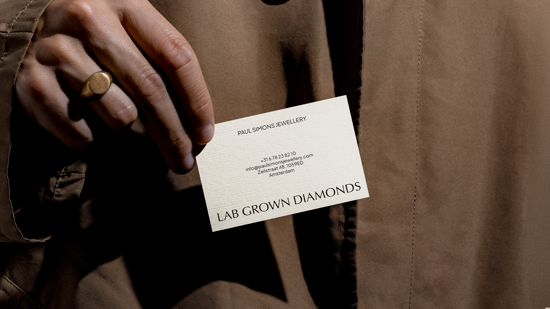
Paul Simons is a jeweller with over 50 years of experience. After a brief break, Paul Simons is back, ready to shake up the industry with a fresh approach that includes sustainable, lab-grown diamonds. The new brand identity needed to appeal to women aged 30-50 who appreciate timeless yet distinctive, contemporary diamond jewellery.


Client: Paul Simons
Agency: Que Pasa Graphics
Design: Yasmine Bouma

CONCEPTING // BRAND IDENTITY // ART-DIRECTION // CONCEPTING // BRAND IDENTITY // ART-DIRECTION // CONCEPTING // BRAND IDENTITY // ART-DIRECTION //

BRAND IDENTITY // ART-DIRECTION // CONCEPTING // BRAND IDENTITY // ART-DIRECTION // CONCEPTING // BRAND IDENTITY // ART-DIRECTION // CONCEPTING

Project

The brand identity for Paul Simons Jewellery is a tribute to its long history of dedication and quality while embracing the future with sustainable and ethical choices, like their lab-grown diamonds. The logo, inspired by Paul Simons' original 1980s design, is hand-drawn, adding a personal and artisanal touch. Nostalgic elements like grainy textures and scan lines evoke a vintage feel with a modern twist.

Paired with a typeface that combines classic and contemporary styles, the overall look is luxurious. Earthy tones, accented with a pop of orange, were carefully selected to convey a sense of quality and craftsmanship. This blend of ‘nostalgia’ with a modern touch creates a strong, recognizable brand that stays true to its roots while resonating with today's consumer.

Next Project