Please wait, amazing things are loading

Gaiyo

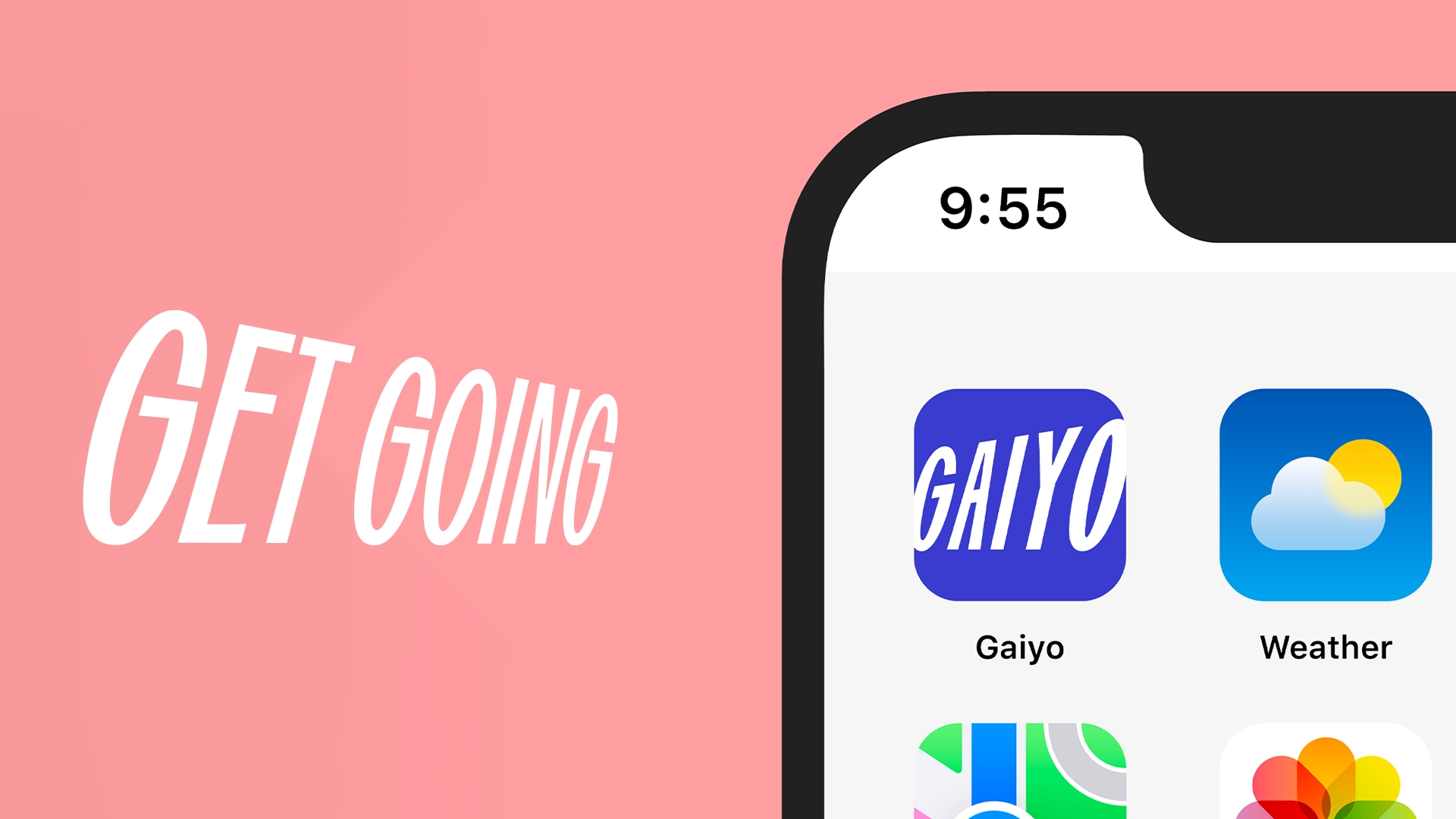
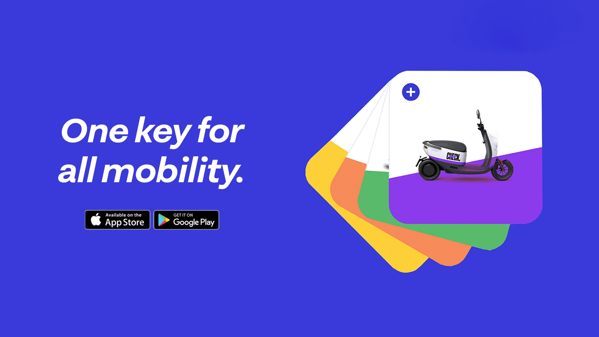
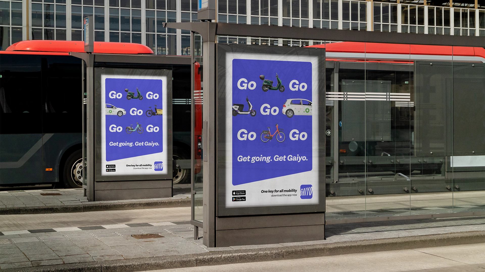
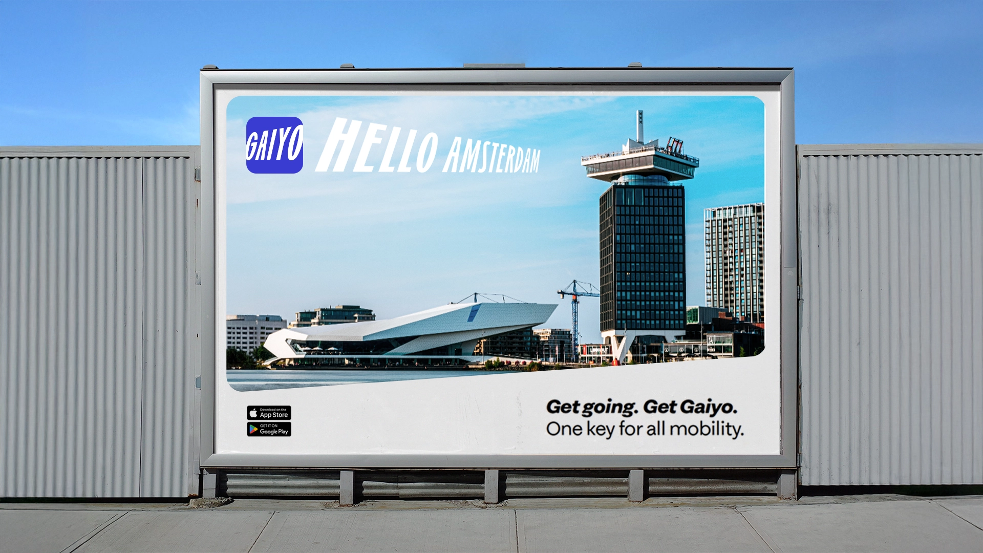
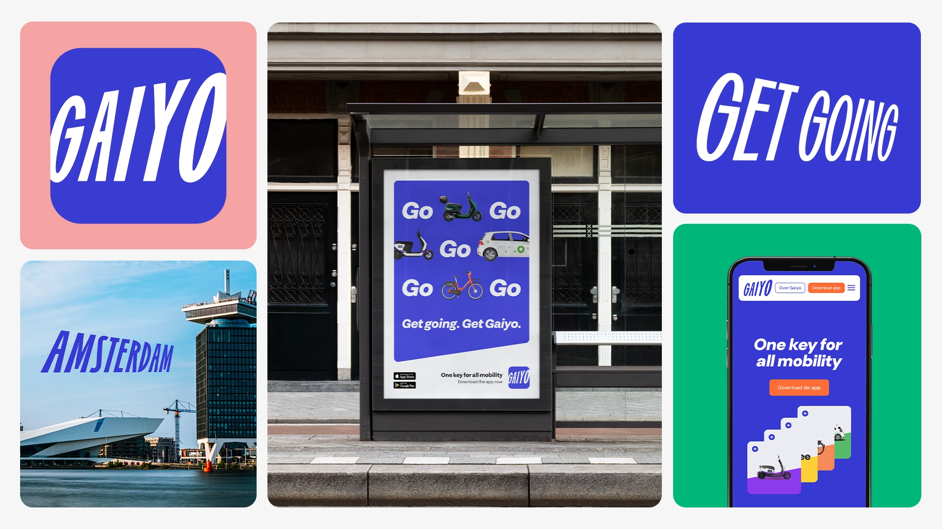
Gaiyo, meaning "overview" in Japanese, is the ultimate app for city mobility. It unites all transportation options, offering a smarter, sustainable way to navigate urban life. No need for multiple apps—Gaiyo gives you a single, comprehensive view of all shared mobility options wherever you are. With partners like NS, Check, Bolt, Cargoroo, and TIER, Gaiyo embodies the philosophy of "own nothing, but have it all."


Client: Gaiyo
Agency: Gardeners
Strategy: Liz van Houten, Pascal van Ham
Design: Gijs Lammers, Yasmine Bouma

DESIGN SYSTEM // REBRANDING // SOCIAL MEDIA // OOH CAMPAIGN // DESIGN SYSTEM // REBRANDING // SOCIAL MEDIA // OOH CAMPAIGN // DESIGN SYSTEM //

// SOCIAL MEDIA // OOH CAMPAIGN // REBRAINDING // DESIGN SYSTEM // SOCIAL MEDIA // OOH CAMPAIGN // REBRAINDING // DESIGN SYSTEM // SOCIAL MEDIA

Project

To align with its new strategy, Gaiyo underwent a dynamic rebranding led by Gijs Lammers. The new logo is both smart and swift, featuring a daring slant and bold design that creates the illusion of wheels in motion, symbolizing mobility. The playful "G" and "O" mimic the look of comic-style speed, making it eye-catching and functional, even in small app store spaces.

The primary color, Slate Blue, ensures brand recognition and differentiation from competitors. I supported the brand development by setting up the brand book, refining the design system, and contributing to the out-of-home (OOH) introduction campaign.

Next Project